Project 01
This project involved using typography to create abstract forms that demonstrate the Gestalt Theory and then documenting two of the best compositions in a hand-crafted book. To begin, I played around with 36 different compositions using different letters and fonts. After picking two that best demonstrated the tension in the figure ground background of the black and white shapes, I created the book documenting my shapes and process. I then bound the book using a pamphlet stitch to be turned in.
The following is the InDesign file of my final book.


Project 02
Our second projected required thinking about who we were as designers and using that to create symbols. We needed to create three unified symbols: one abstract, one pictograph, and one using the our initials. In thinking about who I was as a designer, I thought of three major concepts: programming, geometric, and legible. I knew that I wanted to learn more about design to be used to create better looking websites, apps, and programs. Because of this, I also typically enjoyed and created simpler designs using legible typefaces, simple grids, and basic, geometric forms. I used these ideas to create multiple symbols that I felt really captured these ideas and who I am as a designer.
Below are my final 3 forms.


Project 03
Here we had to use the two forms we'd created in Project 01 to create patterns. Since my shapes were rather unique, I was only able to make a few different patterns that met the guidelines of the project.
These are the patterns I created.


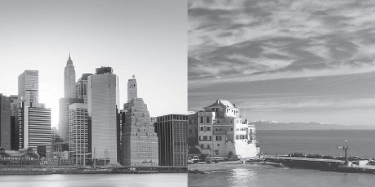
Project 04
The fourth project required taking photos or using found imagery to create a sequence using lines, shapes, or textures found within the photos. We then were to create a bound sequence book of the photos. I chose to use cityscapes as my subject in the book and connected the photos using the lines of the buildings and water.
This is my sequence of 10 photos.


Project 05
For this project, we used our symbols from the second project and Adobe Flash to create an 8 - 15 second animation. I chose to animate a symbol I'd created in the initial steps of the assignment for this animation because I didn't really feel like any of my final three symbols could really be animated.
Video of the full animation: https://www.youtube.com/watch?v=PS4wk7XN0qk&feature=youtu.be
Below are screenshots of every second through the animation.
Below are screenshots of every second through the animation.


Project 06
Here we used images of the Des Moines Art Center to create a poster of a fictional art exhibit featuring the architecture of the building. The project involved using the features of the photo to layout the text in a way that emphasizes the architecture.
The following are all of the posters I created.
The last poster was my final choice to turn in.


Project 07
Project seven was a portfolio book of all the projects we'd created this semester. I chose to keep the layout and design of this book really clean and simple to emphasize the projects while also bringing in colors and layout decisions that were really representative of the types of designs I like.
Below is the InDesign file of my final portfolio.


